When you have a number of websites open in your browser tab, have you ever noticed that small icon? We refer to that as a favicon. Although it may seem unimportant, it actually speeds up website recognition and gives everything a slightly more polished appearance.
Yes, your website needs one. It’s a small detail that can have huge effects on how people perceive and trust your brand.
Don’t worry if you’ve never given favicons much thought; we’re going to explain why they’re important and how to create one that works.
Key Takeaways
- The small icon that shows up in browser tabs, bookmarks, and search results is called a favicon; it is your website’s miniature logo.
- It makes your website easier to find among several open tabs and helps visually reinforce your brand.
- A powerful favicon gives credibility to your website by fostering professionalism and trust.
- Favicons increase click-through rates and user recall, which can aid with visibility even though they have no direct impact on SEO.
- Make sure your favicon is clear, easily identifiable, and consistent with the colors and aesthetic of your brand.
What is a Favicon?
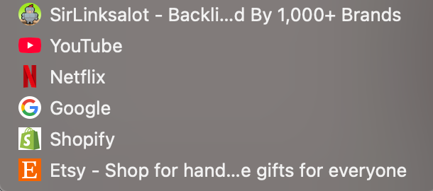
You recognize that little icon you get in your browser tab when you’re on a site? Like the tiny red play icon for YouTube or the blue “F” for Facebook? That’s a favicon. It may be tiny, but it does a lot—makes people notice your site in a hurry, especially if they’ve got 10 tabs open (we’ve all been there).

Favicons are typically only 16×16 pixels, so they’ve got to be basic—imagine a miniature version of your logo, your initials, or even just a sweet little shape or symbol that represents your brand. It’s not always identical to your full logo, but it’s typically a small version of that. It’s one of those tiny tab icons that gets your site to look that much more finished and professional without anyone even knowing.
Importance of Favicons

Favicons may be tiny, but they go a long way towards making your site appear legitimate and professional.
Just imagine them as your site’s shortcut icon—the little image you view alongside a page name in a Google Chrome or any browser tab, in bookmarks, or even in search engine results.
Google, for instance, has a simple “G,” and Twitter (now known as X) has an X. These are extremely recognizable and assist users in instantly linking the icon to the brand.
Brand Recognition
Having a custom favicon increases your brand awareness since individuals begin to equate that picture with your website.
If someone bookmarks your website or goes through their history, a familiar icon makes them pick out your page quicker. Nobody wants to browse through a list of boring globe icons or empty pages attempting to recall which site was which.
Increase Click-Through Rates
Favicons can also increase click-through rates when your site pops up in search results. If your icon stands out and looks clean and professional, people are more likely to click on it because it feels trustworthy.
For example, imagine searching for “best pizza near me” and one of the results has a cute little pizza slice icon next to it—you’re probably going to notice and click that one first.
Better User Experience
Furthermore, from a user interface perspective, it’s just more efficient. Suppose some person has 15 tabs open (which is more often than not), having a unique favicon image makes things significantly simpler for them to instantly go back to your website without having to guess.
Does a Favicon Help in SEO?

Favicons may look like a small image, but they really carry some weight in terms of distinguishing your website. They increase exposure and make it simpler to spot your site, particularly in places such as Google search results, browser tabs, and users’ bookmarks.
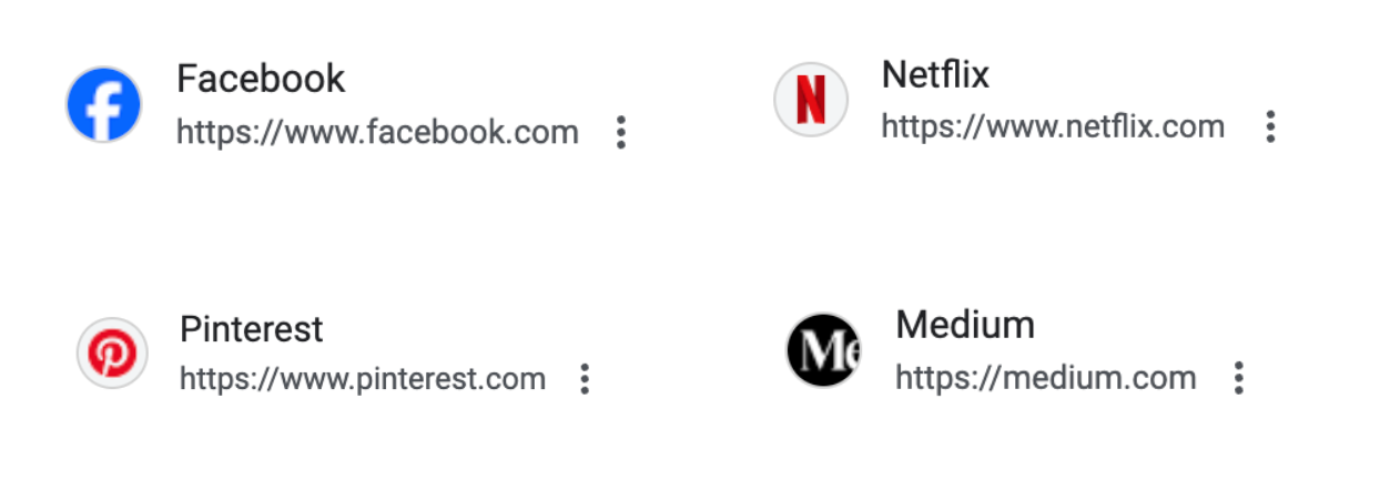
For instance, if you see a small red “N” beside a link, you might recognize it’s Netflix without needing to read the title. That’s the effect of a robust favicon.
When your website appears in a list of search results, a distinctive and recognizable favicon can make it stand out. It’s a subtle means of boosting your click-through rate, particularly if users already know your brand. Humans are drawn to what they know, so if they see your brand’s little icon, they’re more likely to click your link compared to others that appear generic or unknown.
Now, favicons don’t technically influence SEO in the same manner as items like keywords or backlinks do, but they can indirectly increase your ranking because they make your site more accessible to users. Here’s why:
- Search engine identification: Google looks for your favicon when it crawls your website. If it sees one, it might incorporate that icon within search results, making your listing look more refined and professional.
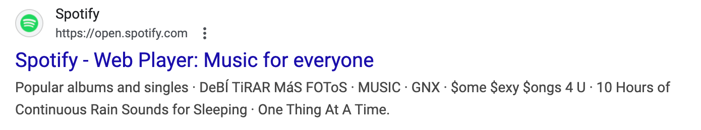
- User recall: Let’s say a user comes to your site, then a few days afterward, they’re browsing their browser history or bookmarks. If your favicon’s memorable, such as Etsy’s tiny orange “E” or Spotify’s green circle, they’re much more likely to remember and come back to your site. That’s additional repeat traffic without additional effort.
- Improved user experience: A well-designed, clean favicon makes your site look complete and reliable. Think of landing on two similar websites—one has a sleek and attractive icon in the tab, and the other displays a blank globe or a generic file icon. Which one seems more legitimate? The majority would opt for the better-looking one.
So although favicons are small, they make a big impact on getting people to remember your site, trust it more, and return. It’s one of those little branding details that is completely worth the effort.
Where Can You See the Favicon Image?
Favicons began in the early days of Internet Explorer (yep, back in 1999), where they appeared alongside “Favorites”—what bookmarks were referred to at the time. That’s actually where the term favicon originated: “favorite” + “icon.”
Fast forward to today, and favicons show up all over the place:
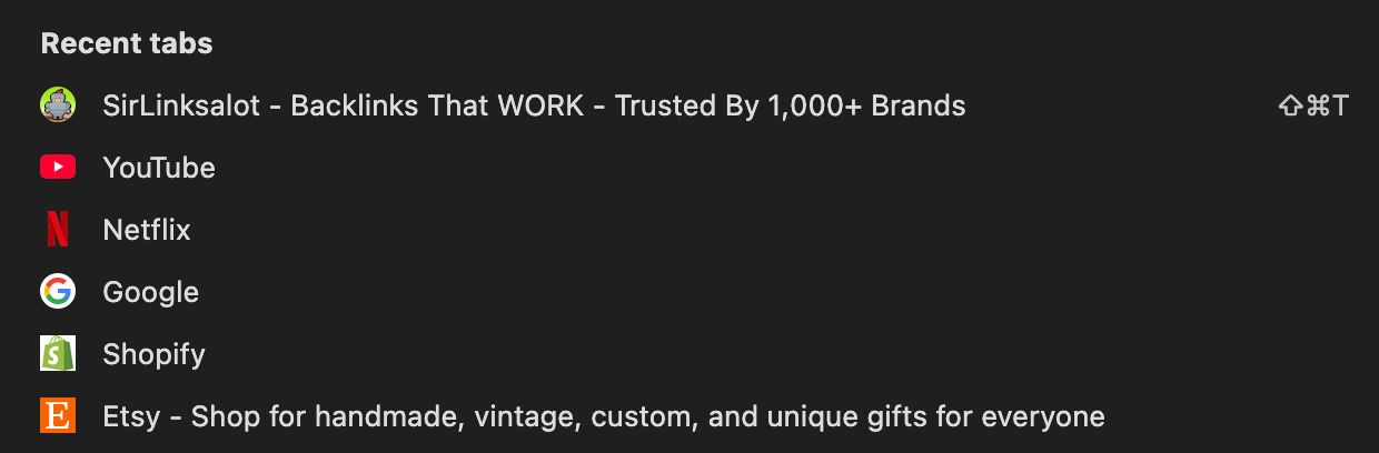
- In web browser tabs (so users can easily find your site when they’ve got 15+ tabs open)

- In bookmarks and favorites bars, as a bookmark icon

- In the bookmarks list
- In the address bar, as the URL icon
![]()
- In your browser history
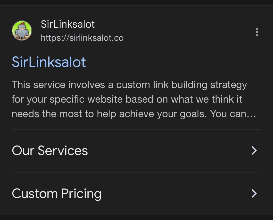
- On search engine results pages (SERPs), Google shows your favicon right next to your site’s name

- On mobile browsers, where space is even tighter and visuals really count
How to Create Favicons?
Planning to design a favicon for your web page? It needn’t be so complicated. You’ve got two alternatives: you can have one professionally designed by a graphic designer or simply use a free favicon generator website to do it yourself.
You can use an online favicon generator such as Favicon.io, RealFaviconGenerator.net, or even Canva to convert a logo, letter, or symbol into a favicon within a matter of clicks.
If you do not wish to make it yourself, then you can certainly hire a freelancer to develop favicons on your behalf. Just go to websites such as Fiverr or Upwork and enter your needs. Soon, you will find yourself with a list of individuals who will be prepared to do the job for you.
However, whether you are creating it yourself or paying someone else to make one for you, there are some things that you should remember.
It Should Match Your Brand Identity
Your favicon serves to reinforce your brand identity each time someone views it. Like Apple, uses a clean, simple apple icon, whereas Slack employs a colorful hashmark that fits its fun, techy personality. It’s all about being immediately recognizable, even at a glance.
For instance, if your logo is a whimsical pink flamingo, don’t reduce it to a dull gray square—stay true to the color and vibe so that people identify it as yours.
A favicon may be small, yet it is the big thing behind how individuals distinguish and recall your site. See it as the digital fingerprint of your brand—you see it displayed in browser windows, bookmarks, search results, and even smartphones.
To get the most out of your favicon, it should be:
- Consistent with your website’s design – If your website uses bold colors and a contemporary font, a plain black-and-white icon would stand out like a sore thumb. Your favicon needs to look like an organic continuation of your brand.
- Aligned with your values and personality – Are you a playful, innovative agency? Perhaps your favicon is colorful and offbeat. Operating a professional law firm? A clean, simple monogram may be preferable. The style must represent what your brand is about.
Remember, even though favicons are part of your first impression in search results, they help people recognize your site faster when they come back. So don’t just treat it as a checkbox—treat it as a key part of your branding toolkit.
Follow the File Format
For favicon file type, you’ve got some great options—.ico,.png, and .svg being the most frequently used. There are pros and cons for each, and the best option depends upon where and when you wish for your favicon to appear. Some common favicon file formats are:
.ico format
This is the OG favicon format. It’s been around since Internet Explorer days and is still supported by pretty much all browsers. One nice thing about .ico files is that they can contain multiple sizes of icons in a single file (such as 16×16, 32×32, and 48×48), which is convenient. But the format is somewhat outdated and less flexible design.
.png format
This is the default for most modern websites. It allows for transparency, so your favicon can have sharp edges or shapes without the white box surrounding it. And it looks great on all contemporary browsers. Just be sure to export it at the correct sizes (such as 16×16 or 32×32).
.svg format
This is a more recent alternative that’s ideal for scalable, high-definition screens. Because it’s a vector format, it has crispness regardless of size—ideal for Retina or 4K displays. It also has a tiny file size. However, not all browsers or platforms currently support SVG favicons, so it’s wise to include fallback formats just in case.
In short:
- Use .ico if you want classic, wide browser compatibility.
- Use .png for a modern, clean look with transparency.
- Use .svg for super-sharp icons on high-res screens (but back it up with .png or .ico just to be safe).
Be Mindful Of the File Size
Also, don’t overlook file size. Favicons are small (typically 16×16 or 32×32 pixels), so no need for a massive, high-resolution image. A large file might make your site slightly slower, particularly on mobile. Just keep it small, light, and web-optimized.
The size of a favicon is supposed to be 16×16 pixels—that’s the little icon that appears in a browser window. But nowadays websites are accessed from all sorts of devices with various screen resolutions, so it is not sufficient anymore to have only one size.
To keep your favicon looking crisp and clear everywhere, it’s a good idea to create multiple versions of it in different sizes, like:
- 16×16 px (for browser tabs)
- 32×32 px (for taskbar shortcut icons and desktop shortcuts)
- 48×48 px (used by some older systems)
- 96×96 px or larger (for high-res screens or app icons)
- 80×180 px (for Apple Touch)
By providing varying sizes, you ensure your icon is crisp no matter if someone’s on a phone, tablet, or high-DPI screen.
Also, take note of the aspect ratio—favicons tend to be square (1:1), so don’t use a wide or tall logo that’ll get distorted. Make it simple and center-aligned so it still appears neat when reduced.
Focus On the Colour Palette
Color is a very important thing when you’re creating your favicon, particularly because it’s such a small area to play with. You only get a handful of pixels to make an impression, so your colors have to really pop and leave a clear definition for your icon.
Contrast is your friend. Colors of high contrast cause shapes and symbols to become prominent, enabling users to pick up on your brand at first glance.
As an example, Spotify’s neon green circle stands out beautifully in comparison to the largely white or grey tabs in current browsers. If they’d used pale green or something far too subtle, it would disappear entirely.
Also, keep in mind that various devices and browsers use various tab backgrounds. Some use white, others dark mode as default, so it’s a good idea to try your favicon on light and dark backgrounds. A dark blue icon with black borders might look fantastic on a white tab, but vanish outright in dark mode.
And if your brand colors aren’t bold, try using a background shape or frame to make your favicon stand out. Like Adobe uses a red square to frame their white letters—basic but totally recognizable.
Abbreviate When Needed
Sometimes, forcing your full logo or a detailed image into a tiny square just doesn’t cut it, particularly when you have only 16×16 pixels to work with. That’s when abbreviations are useful.
A quick, easy trick is to take the first letter of your business name. Loads of large brands do this, such as Facebook with its signature blue “f” or Pinterest’s chic red “P.” It’s neat, easy to identify, and still puts your branding in the spotlight.
If your company has a longer name or more than one word, you may consider using an acronym or abbreviation.
For instance, “Modern Creative Agency” may use “MCA” as the favicon. Or if your brand name is “North Valley Technologies,” you may experiment with “NVT” or simply a clean “N.”
Try a few different variations and see what clicks as the perfect browser favicons. Test uppercase vs. lowercase letters, try adding a background shape or bold color, and check how they look at small sizes. The goal is to find something that still feels like you, even in mini form.
Adding A Favicon For Your WordPress Website
To put a favicon on your WordPress website, ensure your image is a minimum of 512×512 pixels. WordPress supports all standard favicon types, so no problem there.
Here’s how to do it:
- Go to Site Setup and click Customize.
- Click Site Identity—you can see the option to update the favicon.
- Upload your image, then click Publish to save it.
Adding A Favicon For Your Wix Website
Wix will automatically assign your site a simple default favicon, but you can replace it with one of your own after you upgrade to a Premium Plan and add a domain.
Here’s how to replace your favicon on Wix:
- Go to your site’s dashboard and then click Settings.
- To the right of Favicon, click Manage.
- Click Upload Image—either select one you’ve already uploaded or click Upload Media to select a new image from your computer.
- Click Add to Page to see how it’ll appear in the browser tab.
- Then click Save, and you’re finished! Your new favicon will appear once you’ve published your site.
Adding A Favicon For Your Website In HTML
If you used a website builder like Wix or WordPress, you don’t need to mess with HTML to add a favicon—it’s all built in. This step is only for sites that were hand-coded by a developer.
But if that’s your setup, here’s how you’d add a favicon to your site’s header:
<link rel=”icon” type=”image/png” href=”Favicon.png”/>
Conclusion
Although small in size, a well-constructed favicon contributes significantly to building a robust web presence. Keeping it simple, consistent, and in line with your brand allows you to leave a lasting impression that improves user experience and enforces brand identity. Taking time to develop the appropriate favicon is a wise move toward creating a professional and memorable website.